Showing posts with label UBC. Show all posts

Sunday, 2 August 2026

George Bowering's Library

 IS NOW IN THE UBC LIBRARY


The source for the photo above is: "A Reading Room Fit for a Literary Giant: Poet Bowering's Personality Showcased Along With Thousands of His Books," John Mackie, Vancouver Province, June 28, 2026. Here is some text from it:
   "Canada's first Parliamentary Poet Laureate, has written so many books of poetry and prose that it's hard to count, and has given readings and lectures all over the world.
   His latest honour is close to home: His personal library has been set up as a reading room at the University of B.C.'s Irving K. Barber Learning Centre.
    It isn't a replica of his home study, like you might find in a museum. But an estimated 5,000 volumes from Bowering's vast collection now line the shelves of the reading room, with more to come....
    It's not just books, though. Bowering's personality comes through in the improbable memorabilia that is displayed alongside the volumes, such as baseball bobbleheads, a puppy penholder and Hello Kitty collectibles....
Alas, George isn't young anymore - he's 90. His health hasn't been great, and he now uses a wheelchair. His sight is limited, to the point where he can no longer read or write.
   That said, he's just released two books. Pearl (Talonbooks) is billed as his final book of poetry, and Barefoot Gringo (UBC Press) is a Boweringesque take on his travels to Mexico.
   He still has enough energy to power a small city. Maybe Penticton, where he was born on Dec. 1, 1935, or Oliver, where he grew up.
   Bowering remains as engaging as ever, laughing and telling a dizzying number of stories and anecdotes during a visit to the space, which is officially known as the George Bowering Modernists and Post-modernists Collection."

   If you curious about UBC acquiring such a collection see: "UBC Library Achieves Funding Goal for the George Bowering Reading Room," Library Communications, March 3, 2025. Remember also that in MM there was a recent post about the University of Miami acquiring Jackie Gleason's library and that Philip Roth's library can be found in the Newark Public Library!
   If you noticed the word "Poet" in the headline and are not interested, remember that Bowering wrote many books, including some about baseball. It takes a while to scroll through the list of works written by Bowering in his Wikipedia entry.
   If you associate Bowering with B.C., don't forget that he studied at UWO and was a writer in residence there. Among his books, you will find this one: The Moustache: Memories of Greg Curnoe. 
   
There are over 100 works by Bowering in the Western Libraries and the LPL has around 20, including this one: 

If you are now interested, here is a good place to begin for more about Bowering: Georgebowering.com.

Saturday, 16 May 2026

Beautiful Campuses

    The news related to colleges and universities is mostly of the bad kind these days. It is spring, however,  in some parts of the world (but not yet in Ontario), where blossoms are in bloom and commencement speeches are sprouting on campuses which are often attractive oases. So, let's focus on them.
   Take a break from the bad news and enjoy visiting these institutions of higher education which are described as some of the "most stunning college campuses in the world." Two are located in Canada.

39 Beautiful Campuses


1.Flagler College, Florida
2. Trinity College, Dublin
3. The University of the South, Tennessee
4. Queen’s University, Ireland
5. Princeton University, New Jersey
6. Cornell University, New York
7. Dartmouth College, New Hampshire
8. University of Colorado at Boulder
9. Royal Roads University, British Columbia
10. University of San Diego, California
11. University of London, England
12. Furman University, South Carolina
13. University of Cambridge, England
14. Kenyon College, Ohio
15. Harvard University, Massachusetts
16. University of Edinburgh, Scotland
17. Hong Kong University of Science and Technology
18. Notre Dame University, Indiana
19. University of Oxford, England
20. Pepperdine University, California
21. University of Bologna, Italy
22. University of British Columbia, Vancouver
23. University of Capetown, South Africa
24. University of Chicago, Illinois
25. University of Glasgow, Scotland
26. University of Hawaii at Manoa
27. University of Otago, New Zealand
28. University of Virginia, Virginia
29. Stanford University, California
30. University of Sydney, Australia
31. Yale University, Connecticut
32. The College of William & Mary, Virginia
33. University of Queensland, Australia
34. Villanova University, Pennsylvania
35. University of Cincinnati, Ohio
36. University of Coimbra, Portugal
37. College of Charleston, South Carolina
38. Tsinghua University, China
39. University of Washington, Washington

Sources:
   
This list is from: "
The 39 Most Stunning College Campuses in the World: If We Had to do Undergrad Over Again, We'd Enroll Here," Korin Miller, House Beautiful, April 1, 2026. Both pictures are from the article and there are more. The top one is of Royal Roads and the bottom is of the library at Trinity College, Dublin.
   I was led to that article by this one: "Two Canadian Universities Ranked Most Beautiful College Campuses in the World," Daniel Chai, Daily Hive. Apr 11 2026.
   "Studying at university is hard work, which is why it’s important to schedule in breaks from the books while you’re on campus. For those attending two Canadian universities on a new list of the most stunning college campuses in the world, you’ll find plenty of beautiful spaces to recharge....
   "The ranking, recently published by interior decorating magazine House Beautiful, named Royal Roads University in Victoria and the University of British Columbia (UBC) in the top 25.
   According to House Beautiful, the campuses on the list are remarkable in every sense.
   “They offer far more than academic spaces—they foster creativity, inspiration, and a rich cultural atmosphere that enhances student life,” said author Korin Miller.
   “We’ve searched far and wide, even reaching destinations like Australia, to showcase some of the most visually striking universities worldwide.”
   Royal Roads University cracked the top 10 in ninth spot, with the Hatley Park National Historic Site described as “pretty incredible.”
“The rest of campus does not disappoint, with 642 acres of vibrant greenery and spectacular views of the Strait of Juan de Fuca and the exotic Japanese Garden.”  
   UBC landed in 22nd place on the list of the most stunning college campuses in the world, with its access to both mountains and beaches being a top reason."

   If you are impressed that Royal Roads occupies 642 acres, you will be more impressed by the 27,000 acres in Georgia that contain Berry College. If you go to the bottom of that post you will learn that Sewanee (No.3, The University of the South) sits in "The Domain" which consists of 13,000 acres. Since you are unlikely to do that, I will provide the two additional references you would have found there: "America's Most Beautiful College Campuses," Travel + Leisure, June 24, 2021.  See also: "South's Most Beautiful Colleges 2020," by Jennifer Chappell Smith, Southern Living, Sept. 11, 2020.

   If you think retiring and relocating to be near such places would be a good thing see, "University Retirement Communities."   There is a new retirement community for old people at Berry College - The Spires at Berry College - and here is their description:
"Celebrated as “America’s most beautiful college campus” and nestled alongside pristine Eagle Lake at the foot of Lavender Mountain, our location at Berry College is without question a picturesque place to retire. Even better, this incredible lakeside sanctuary serves as the setting for senior living that feels every bit as good as it looks."
   Western University is still a beautiful place, but not quite as beautiful as UWO was. I just hope the Pawpaw Trees planted there, survive our very cold spring. 

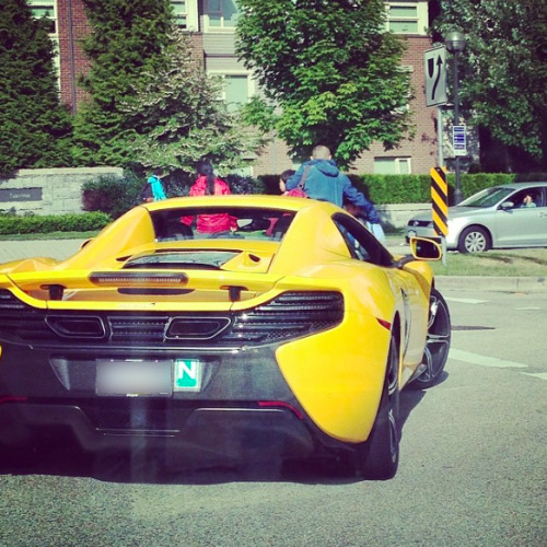
The Bonus: UBC (No.22) is also known as, The University of Beautiful Cars. 

Sunday, 15 March 2026

Dyslexia and Decorum

  A lack of the latter was again displayed in what passes for public discourse these days. On a book tour, California Governor Gavin Newsom has mentioned his dyslexia which is covered in his book. President Trump took notice and, with his usual empathy remarked that Newson “said, in a speech, he was dumb, had low Boards, can’t read, has dyslexia, and has a mental disorder — A Cognitive Mess!”
  I should note that Newsom’s response was also a little less than decorous: “Newsom fired back at Trump on the social platform X, saying, “I spoke about my dyslexia.” “I know that’s hard for a brain-dead moron who bombs children and protects pedophiles to understand,” he added.”

This is not the first time the Trump administration has demonstrated a lack of concern for those with dyslexia, among, it must be admitted, a very large number of other groups for which little concern is shown.


Font Fights

    In the Great Reaction and backlash to the somewhat excessive efforts of the DEI folks, there was one you likely missed. It came at the tail-end of last year and involved typeface, which was just typed in a different way and you may not have noticed. For people with various visual disabilities, like dyslexia, the types of typefaces can make a difference.
  Way back in 2023 during the Biden Administration, Secretary of State, Antony Blinken issued a directive that the State Department drop the typeface, Times New Roman and adopt Calibri. Calibri is more accessible it was argued and Blinken said “that Times New Roman “can introduce accessibility issues for individuals with disabilities who use Optical Character Recognition technology or screen readers.”


  On Dec. 9, 2025, Secretary of State Marco Rubio issued a new directive. Marco’s memo has, as its subject heading: “Return to Tradition: Times New Roman 14-Point Font Required for All Department Paper,” Rubio called Calibri “informal” and said it “clashes” with State letterhead. He also criticized it as a “radical” diversity, equity, inclusion, and accessibility initiative.” The reaction was immediate.

  On Dec. 10, this response to the Times New Roman directive appeared in The New York Times. Since it is likely you chose not to read this typeface article, given all the other Trump news, much of it is reproduced below, where the issues and arguments are displayed in Arial.

“A Typeface Falls Victim In the Push Against D.E.I.: Secretary of State Marco Rubio Called the Biden-era Move to the Sans Serif Typeface ''wasteful,'' Casting the Return to Times New Roman as Part of a Push to Stamp out Diversity Efforts,” 

 by Mike Crowley and Hamed Aleaziz.
    Secretary of State Marco Rubio waded into the surprisingly fraught politics of typefaces on Tuesday with an order halting the State Department's official use of Calibri, reversing a 2023 Biden-era directive that Mr. Rubio called a ''wasteful'' sop to diversity.
  While mostly framed as a matter of clarity and formality in presentation, Mr. Rubio's directive to all diplomatic posts around the world blamed ''radical'' diversity, equity, inclusion and accessibility programs for what he said was a misguided and ineffective switch from the serif typeface Times New Roman to sans serif Calibri in official department paperwork.

   In an ''Action Request'' memo obtained by The New York Times, Mr. Rubio said that switching back to the use of Times New Roman would ''restore decorum and professionalism to the department's written work.'' Calibri is ''informal'' when compared to serif typefaces like Times New Roman, the order said, and ''clashes'' with the department's official letterhead….
  Mr. Rubio's directive, under the subject line ''Return to Tradition: Times New Roman 14-Point Font Required for All Department Paper,'' served as the latest attempt by the Trump administration to stamp out remnants of diversity initiatives across the federal government.

   Then-Secretary of State Antony J. Blinken ordered the 2023 typeface shift on the recommendation of the State Department's office of diversity and inclusion, which Mr. Rubio has since abolished. The change was meant to improve accessibility for readers with disabilities, such as low vision and dyslexia, and people who use assistive technologies, such as screen readers.

   Calibri, sometimes described as soft and modern, is typically considered more accessible for people with reading challenges thanks to its simpler shapes and wider spacing, which make its letters easier to distinguish. Mr. Blinken's move was applauded by accessibility advocates.

   But Mr. Rubio's order rejected the grounds for the switch. The change, he allowed, ''was not among the department's most illegal, immoral, radical or wasteful instances of D.E.I.A.,'' the acronym for diversity, equity, inclusion and accessibility. But Mr. Rubio called it a failure by its own standards, saying that ''accessibility-based document remediation cases'' at the department had not declined.

  ''Switching to Calibri achieved nothing except the degradation of the department's official correspondence,'' Mr. Rubio said. He noted that Times New Roman had been the department's official typeface for nearly 20 years until the 2023 change. (Before 2004, the State Department used Courier New.)

  Echoing President Trump's call for classical style in federal architecture, Mr. Rubio's order cited the origins of serif typefaces in Roman antiquity. Those typefaces, which are used by The New York Times, include small strokes at the edges of many characters.

   Admirers say those flourishes make letters look more elegant and make them easier to distinguish from one another, even though they can also create a sense of clutter.

  Serif typefaces are ''generally perceived to connote tradition, formality and ceremony,'' Mr. Rubio's order said, adding that they were used by the White House, Supreme Court and other state and federal government entities, as well as in the script on the side of Air Force One.

   Many diplomats are unhappy with changes Mr. Rubio has made to the department's structure and leadership, and have reported badly damaged morale within their ranks. But the Biden administration's move to Calibri prompted some grumbling from some traditionalists who preferred Times New Roman. Mr. Blinken also changed the standard font size, from 14-point to 15-point, requiring extra keystrokes that some diplomats found annoying.”

   
  A few days later there was this follow-up piece in the Times: “Is Times New Roman Better Than Calibri for the State Department?” by Jonatha Corum, Dec.13. Perhaps this is the most important point in it: “I wonder if it’s all a bit of a distraction from what the State Department is actually doing, rather than the font they’re doing it in,” said Tobias Frere-Jones, a type designer known for Gotham, Interstate and other ubiquitous typefaces. “But it is an opportunity to talk about what makes things legible.” Perhaps the larger question is not which typeface is best, or the rationale for the change, but whether the clever people in the Trump administration deliberately chose Times New Roman to sabotage Newsom's run for the presidency. One would not want to elect a president who could not read the State Department memos. Or, the hugest question might be, to use a word of the kind often employed by the current President, do you think President Trump has ever read a State Department memo?

Sources: I have provided enough for this typeface topic and you can easily find some on your own. I could offer more, but will just give you the one with the best title: "A New Serif in Town: Trump's Font Culture War" by Will Barker in The Week:UK. CANCON Up here in the north things tend to move at a glacial pace, which has been quickening. DEI mantras arrived here fairly fast, but the Great Reaction is just now beginning and only the most extreme DEI demands have started to melt. On the language front, things seem fairly calm. The Government of Canada has enough problems in sending out memos in the two official languages so font issues are probably on the back burners. It is the case, however, that several new languages, which are very old, have been added and typeface traumas may be in the offing. Fonts for some of the Indigenous languages are being developed, particularly in British Columbia, but there are sure to be complaints from settlers who will not be able to find the characters on their keyboards, which sometimes are now required in official documents. There are many examples. The first one below is an "Acknowledgement" and the second a sign.

“This place is the unceded and ancestral territory of the hÉ™n̓q̓É™min̓É™m̓ and Sḵwx̱wú7mesh speaking peoples, the xÊ·məθkÊ·É™y̓É™m (Musqueam), Sḵwx̱wú7mesh (Squamish), and sÉ™lilwÉ™taɬ (Tsleil-Waututh) Nations, and has been stewarded by them since time immemorial.”

Sunday, 29 October 2023

B.C. Tidbits or Titbits: Take Your Pick


 This blog was abandoned over three weeks ago because I was in British Columbia for part of that time and have been experiencing trip-lag during the rest of it. Now the weather has turned and I am inside, without excuses, although I may have to come up with some if I can't increase my blogging output. 

  B.C. is a marvelous and scenic place and many interesting things happened there while I was in it, but not to me. Unless I include items relating to my children and grandchildren about whom you are not interested. Therefore, I will simply present past material about British Columbia, which is very interesting, but which you will likely not have read. In the academic world, where I was a minor citizen, presenting links to past work is known as "self-citation", and I am guilty of it here, but only for the legitimate reasons hinted at in this definition: "Self-citation occurs in an article when an author references another of their own publications. This can be a legitimate way to reference earlier findings; but self-citations can sometimes be unduly made in an attempt to inflate an individual's citation count."

 
The good news for an increasingly small number of us is that British Columbia is still called "British Columbia." I had suggested that it was likely (and likely still is) to be given a new shiny name or a duller, pre-colonial one. See: "British Columbia or Sasquatchia? There is more good news (for a few) in that, although the elementary school which the grandchildren attend was retrofitted to withstand the coming earthquake, the name was not changed and remains as, "David Livingstone Elementary School." The Vancouver School Board "Archives & Heritage Blog," indicates that it was named for that David Livingstone, but apparently no one has read it or thought much about the name of the school. If they do, there will be a call for a change since it is now known that Livingstone should never have been on the African continent and Stanley should never have bothered looking for him. As an aside, it should be noted that the folks in London are perhaps more progressive than those in Vancouver. The father of the children who go to David Livingston, attended "Ryerson Public School" in London, which has now the very imaginative moniker, "Old North Public School."

  My post about B.C. last year was titled, "The Left Coast", not for political reasons, but because residents there once drove on the left-hand side of the road as a result of the retrograde attitudes of the British colonialists. Another, "Notes From the Coast", describes the "atmospheric rivers', which were flowing again this year.

  The crows which darken the often dark sky over Vancouver were still able to fly against the flow of the atmospheric rivers. See, a "Murder of Crows."

   Although we did not go to the Van Dusen Botanical Gardens and the Yosef Wosk Library located there, you can learn more about the philanthropist, Mr.,Dr.,Dr.,Rabbi Wosk by reading "Unexpected Libraries" or the section about him in, "Olde Posts Addenda."

  We also did not make it up to UBC, but I am sure it is still the "University of Beautiful Cars," since we saw many on the streets close by. I did not notice any 
Cullinans, but I did see a few Rivians. Other evidence of opulence abounds even though one sees many people apparently without homes. Back in the early years of the last century one could get a piece of property in B.C. by subscribing to a magazine, see: "Property in British Columbia."

  We did see the sculptures of Parviz Tanavoli at the Vancouver Art Gallery, but, being white, were made to feel somewhat guilty by another exhibition, "Conceptions of White" which was designed to help "viewers grapple with contemporary configurations of White identity." Those who created the rather crude collage probably aren't aware of "A Black Sculpture" found in a back yard elsewhere in the city. It was based on an event that happened many years ago on the Eastern Shore of Maryland where I grew up and which I would have more reason to feel guilty about if I thought guilt was heritable and that I was accountable for the historical acts of others.

   This has been a useful exercise for me, if not an enjoyable reading experience for you. I often don't properly "tag" posts in MM and had difficulty finding some of these that relate to B.C. There may be more. For example, you will learn about the "British Columbia Food History Network" in my post about "Food History." and about the "Angling Books" found in the "Harry Hawthorn Foundation Collection" at UBC.

The Bonus:
   If you want more old news from British Columbia, be sure to visit "BC Historical Newspapers" where you will find hundreds of digitized newspapers dating from the mid-1850s. Unfortunately there will be fewer of them in the future. Both the Alaska Highway News and the Dawson Creek Mirror recently stopped publishing. See:"As B.C. Communities Lose TheIr Last Newspapers, Hope Emerges For Locally Owned Publications," Kate Partridge, CBC News, Oct. 18, 2023.

Tuesday, 29 June 2021

Sobriety May Be Overrated

 Ammo for Alkies

  
    I read a book review this morning that provides me with an opportunity to break free from a minor case of "blogger's block" which, like many cases of "writer's block", is symptomatic of nothing more than nice summer weather. This will be kept short and I will make clear that the sage wisdom offered is meant for those who: 1) prefer not to be sober; 2) like to consume alcoholic beverages; 3) need a better rationale for doing so; 4) need one quickly for the approaching holiday and 5) want to feel less guilty when leaving the LCBO store or pub. 

  If you incline toward intoxication, you would have been intrigued, as I was, by the title of a review that reads: "A History of Getting Hammered, and Why Some of Us Should Keep Doing It," by Zoe Lescaze, New York Times, June 19, 2021. I realize that those of you on the far right side of things, think that the New York Times is not to be trusted, so I will quickly add that the book under review was written by a university professor. I suppose that doesn't help much for those of you in that category, but I will quickly add again, for my Canadian readers, the fact that the professor resides at a respected Canadian university (UBC.) The title of the book is, for us boozers, as compelling as the title of the review; it is: Drunk: How We Slippped, Danced and Stumbled Our Way to Civilization.  The author is Professor Edward Slingerland and he is a Distinguished University Scholar, whose skills are appreciated in different departments, even in different faculties. He is also a PHILOSOPHER, so if you buy this book, you will be looking at an academic treatise that helps you justify your alcohol consumption, plus you will be the only one at the beach not reading a book by James PATTERSON.
  

   Happy hour approaches, so I will now turn this over to the reviewers and sources, and highlight the bits that you need if you are drinking too much and don't have time to actually read the book. 

   After noting that, even Frederick the Great of Prussia recognized "that beer was a uniquely powerful bonding agent, and key to morale,"the reviewer, Ms Lescaze, goes on to offer the following points:
For thousands of years cultures around the world have “implicitly understood that the sober, rational, calculating individual mind is a barrier to social trust,” Edward Slingerland writes in “Drunk: How We Sipped, Danced, and Stumbled Our Way to Civilization,” an effervescent new study that’s equal parts anthropology, psychology and evolutionary biology. Drawing on recent experiments, Neolithic burials, eclectic myths and global literature, Slingerland teases out the evolutionary advantages and enduring benefits of getting blitzed. It’s a rowdy banquet of a book in which the ancient Roman historian Tacitus, Lord Byron, Timothy Leary, George Washington, the Chinese poet Tao Yuanming and many others toast the merits of drowning Apollonian reason in Dionysian abandon..."
"For our ancestors, inebriation was especially essential, “a robust and elegant response to the challenges of getting a selfish, suspicious, narrowly goal-oriented primate to loosen up and connect with strangers.” This is why hunter-gatherers likely began producing beer and wine before bread...."
“It is no accident that, in the brutal competition of cultural groups from which civilizations emerged, it is the drinkers, smokers and trippers who emerged triumphant,” Slingerland writes: Human society would not exist without ample lubrication..."

Disclaimer Alert

   I realize it is a little late and I should have provided this warning at the beginning.  But, in my defence, I only realized that such a warning is now required, when I saw one at the beginning of a CBC report about an upcoming quilting convention in Moose Jaw.  I did not risk reading on, in that case and am not sure what was upsetting, or who was being offended.  Perhaps the quilters simply forgot to ask the Indigenous for permission to temporarily occupy their space. 
   I hope you have not been made anxious or traumatized  by what has been written here so far, but I suggest you have a drink if you want to continue.

An Additional Warning

   Everyone now is rather 'touchy' and as a society we are tending toward temperance, so to protect myself and Professor Slingerland from those such as the MADD people, it should be noted that excessive alcohol consumption has been associated with some health concerns. Even my drinking buddies know that and practice moderation in some matters and generally avoid butter on their toast and salt on their eggs. The professor acknowledges this issue:
Slingerland is adamant that chemically induced communion is just as valuable (and perhaps particularly necessary) in modern times, but he does address alcohol’s more obvious medical and economic costs, the devastating effects of addiction and the subtle, pernicious ways in which drinking can alienate and exclude outsiders. Some readers might find the treatment cursory given the gravity of these issues, but Slingerland simply argues that they have been well documented, whereas serious scholarly work on the value of intoxication is surprisingly scant. As a result, poor alcohol stands “defenseless” against doctors and government policymakers who paint it as pure vice. Slingerland takes up the cause with all the chivalry of a knight-errant, and his infectious passion makes this book a romp as well as a refreshingly erudite rejoinder to the prevailing wisdom.

   Additional information is provided by the publishers, Hachette Book Group, where this blurb is found: 
A "entertaining and enlightening" deep dive into the alcohol-soaked origins of civilization—and the evolutionary roots of humanity’s appetite for intoxication. (Daniel E. Lieberman, author of Exercised)

  Another review is found in the New Scientist and this is found in it:
Slingerland, a philosopher at the University of British Columbia in Canada, has a novel thesis, arguing that by causing humans “to become, at least temporarily, more creative, cultural, and communal… intoxicants provided the spark that allowed us to form truly large-scale groups”. In short, without them, civilisation might not have been possible.
See: "Drunk Review: Could Alcohol-induced Creativity Be Key to Civilisation?" June 2, 2021.

   See also the review in the New York Journal of Books:
Slingerhand does not defend alcohol, but he does point out that it has positive benefits from the past to the present. Alcohol serves as a disinfectant (including for water) and as an anti-parasite medicine, including anti-fungal protection.
“Drunken words are spoken straight from the heart” and Slingerhand devotes much space to the many different dimensions of social drinking. “Sobriety diminishes, discriminates, and says no; drunkenness expands, unites, and says yes.” “The political function of alcohol is practical as well as symbolic.”

   For more, go directly to:
The Wikipedia entry for Professor Slingerland.
The website for the book:  

The Bonus:
Professor Slingerland has authored other works including: Tying Not To Try. Perhaps he is a better professor than some found on the other side of campus. Our granddaughter is enrolled at UBC. Maybe I will encourage her to stroll over there when an actual visit is allowed. 
In Trying Not To Try, Edward Slingerland explains why we find spontaneity so elusive, and shows how early Chinese thought points the way to happier, more authentic lives. We’ve long been told that the way to achieve our goals is through careful reasoning and conscious effort. But recent research suggests that many aspects of a satisfying life, like happiness and spontaneity, are best pursued indirectly. The early Chinese philosophers knew this, and they wrote extensively about an effortless way of being in the world, which they called wu-wei (ooo-way). They believed it was the source of all success in life, and they developed various strategies for getting it and hanging on to it.


Tuesday, 24 July 2018

CULLINAN


Cullinan is the name of a town in South Africa and it is also the name of a very large diamond which was found there. Now it is also the name of an automobile manufactured by Rolls-Royce and an inordinate number of them can be found in Vancouver. That city was chosen for the launch recently of this tough and expensive SUV. Six were sold on the first day. Each costs about $400,000.
Sometimes the assumptions we make turn out to be true. When visiting Vancouver one quickly gets the impression that the city has more than its fair share of fine vehicles, many of them driven by Asians who look to be adolescents. The fact that they are indeed young is verified somewhat when there is a large N affixed to the rear of the $250,000 car (indicating that a 'Novice" is behind the wheel). According to a Roll's dealer, over 70% of his customers are Asian, One of them has 14 Rolls- Royces. Many clients are female and many of those under 30 buy either the Wraith coupe or the Dawn convertible.
  To park such thoroughbreds a new car condo is being constructed. They will be secure in the gated building which supposedly provides good views and air conditioning. According the the Chinese-English website, 80% of the units are booked.


UBC - The University of Beautiful Cars

McLaren MP4-12C Convertible
UBC, Vancouver

     When they are not driving around the city, some may be studying at UBC where such large numbers of exotic cars have been spotted that the initials of that university have been altered.  The one above is a McLaren and I can assure you that it is more expensive than any vehicle made by Mitsubishi.

Sources:

     "Rich Moms and Millennials Make Canada Hot for Rolls-Royce," Natalie Obiko Pearson, Bloomberg News, June 6,2018.
     "With the New Cullinan, Rolls-Royce Reveals a Diamond in the Rough," Brendan McAleer, The Globe and Mail, May 28, 2018.
     There are a couple of websites about the University of Beautiful Cars. See for example:
http://universityofbeautifulcars.tumblr.com/u

Post Script
     Such expensive vehicles are causing problems for the provincial insurer. Minor fender-benders cause major expenditures.

     I suppose the marketing people at Rolls were not overly worried about the postcolonial implications of choosing a name which is derived from the diamond magnate - Thomas Cullinan.

    I would imagine that Western would be lower in the car ranking category than UBC.  I remember , however, conversations here in London about the luxury vehicles noted on the campus parking lots, particularly at one of the affiliated colleges.  My impression is that Western is quite strong on this scale and that impression was buttressed when I came out of Weldon Library on a Sunday this spring and a car like this one was parked next to mine. I had to go home and look it up to identify it.